Creating a visually stunning and reader-friendly fashion magazine layout is no small feat. It requires a keen eye for design, a deep understanding of the target audience, and a flair for creativity. Whether you’re an aspiring graphic designer, a seasoned editor, or simply someone with a passion for fashion, this guide will walk you through the essentials of crafting a compelling magazine layout. From choosing the right fonts to understanding the importance of white space, we’ll cover everything you need to know to make your publication stand out.
Why Layout Matters in Fashion Magazines
In the world of fashion, aesthetics are everything. The layout of a fashion magazine is just as important as the content within it. A well-designed layout not only grabs the reader’s attention but also enhances the overall reading experience. It sets the tone for the magazine, reflects the brand’s identity, and helps to tell the story of the fashion being showcased. But what exactly goes into creating a captivating layout? Let’s dive in.
The Foundation of a Fashion Magazine Layout
1. Understanding the Audience
Before you even begin sketching out your layout ideas, it’s crucial to understand who your audience is. Are you targeting high-end fashion enthusiasts, or is your magazine more geared towards a younger, trend-driven demographic? The answer to this question will guide your design choices, from the color palette to the typefaces you select.
2. The Grid System: Your Best Friend
A grid system is the backbone of any good magazine layout. It helps to create a sense of order and consistency throughout the pages. Whether you opt for a simple two-column layout or something more complex, a grid ensures that all elements on the page align perfectly. This not only makes your magazine look more professional but also makes it easier for readers to follow the content.
3. Typography: Making a Statement
Typography plays a crucial role in the overall aesthetic of your fashion magazine layout. The fonts you choose should complement the content and the overall style of the magazine. For example, a luxury fashion magazine might opt for elegant serif fonts, while a more modern publication might lean towards sleek sans-serif typefaces. Don’t be afraid to mix and match fonts, but be sure to maintain consistency throughout.
4. White Space: The Unsung Hero
White space, or negative space, is the area of the page that is left blank. It might seem counterintuitive, but white space is vital in creating a clean and balanced layout. It gives the reader’s eyes a place to rest and can highlight the importance of other elements on the page. In fashion magazine layouts, where visuals are often bold and striking, white space can provide the perfect contrast.
Designing the Cover: The First Impression
The cover of your fashion magazine is the first thing potential readers will see, so it needs to make a strong impression. Here are some key elements to consider:
1. The Cover Image
The cover image should be eye-catching and relevant to the magazine’s theme. Whether it’s a high-fashion model, a celebrity, or an artistic representation, the image should convey the essence of what’s inside.
2. The Masthead
The masthead is the name of the magazine, usually placed at the top of the cover. It should be prominent and instantly recognizable. The font and color of the masthead should reflect the brand identity.
3. Cover Lines
Cover lines are the headlines on the cover that tease the content inside. They should be short, punchy, and engaging. Use them to highlight the most exciting features of the magazine.
4. The Importance of Balance
When designing the cover, balance is key. Make sure the image, masthead, and cover lines are well-proportioned and don’t overcrowd the page. The goal is to create a harmonious composition that draws the reader in.
Inside Pages: Where Content Meets Creativity
The inside pages of your fashion magazine are where you can really let your creativity shine. Here’s how to ensure they are both visually appealing and easy to navigate.
1. Feature Articles
Feature articles are the heart of any fashion magazine. These are typically longer pieces that require a more thoughtful layout. Use a mix of text and visuals to keep the reader engaged. Large pull quotes, full-page images, and drop caps are all effective tools to break up the text and add visual interest.
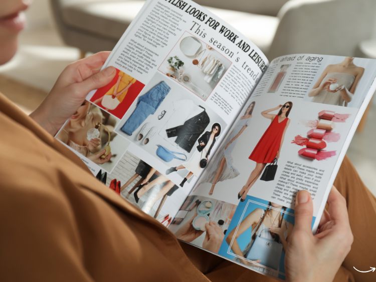
2. Editorial Spreads
Editorial spreads are where fashion photography takes center stage. These pages often feature full-bleed images, minimal text, and creative compositions. The key to a successful editorial spread is to let the images speak for themselves. Use text sparingly and focus on creating a narrative through the visuals.
3. The Use of Color
Color plays a significant role in setting the mood of your magazine. Whether you opt for a monochromatic palette or a mix of bold colors, make sure the colors you choose are consistent with the magazine’s overall theme. Be mindful of how colors interact with each other and how they can affect the readability of the text.
4. Infographics and Data Visualization
Incorporating infographics and data visualization into your fashion magazine layout can be a great way to present information in a visually engaging way. Whether it’s a breakdown of the latest fashion trends or a timeline of a designer’s career, infographics can help convey complex information quickly and effectively.
The Role of Photography in Fashion Magazine Layout
Photography is the cornerstone of any fashion magazine. The way images are presented can make or break the overall layout.
1. High-Quality Images
Ensure that all images used in the magazine are of the highest quality. This means high resolution, good lighting, and strong composition. Blurry or poorly lit images can detract from the professionalism of the magazine.
2. Image Placement
The placement of images should feel natural and balanced. Avoid placing too many images on one page, as this can make the layout feel cluttered. Instead, use a mix of full-page images, smaller images, and text to create a dynamic layout.
3. Captions and Credits
Don’t forget to include captions and credits for all images. Captions can provide additional context or information, while credits ensure that photographers and models are properly acknowledged.
4. Creative Image Treatments
Experimenting with creative image treatments, such as overlays, filters, or collages, can add a unique touch to your fashion magazine layout. Just be careful not to overdo it—too many effects can make the layout look busy and distracting.
Ensuring Readability: The Balance Between Text and Visuals
While fashion magazines are visually driven, the text is still an essential component. Here’s how to ensure that your layout is not only beautiful but also readable.
1. Font Size and Line Spacing
Choose a font size that is easy to read, especially for body text. The standard size is usually between 10 and 12 points. Line spacing, or leading, should also be carefully considered. Too little spacing can make the text hard to read, while too much can make the layout look disjointed.
2. Column Width
The width of your text columns plays a significant role in readability. If the columns are too wide, the reader’s eyes can tire quickly. If they are too narrow, the text can become difficult to follow. A good rule of thumb is to aim for 50-70 characters per line.
3. Contrast
Ensure there is sufficient contrast between the text and the background. Dark text on a light background is usually the easiest to read. Avoid using colors that clash or are too similar, as this can strain the reader’s eyes.
4. Hierarchy and Emphasis
Establish a clear hierarchy in your text by using different font sizes, weights, and styles. Headlines should be bold and prominent, subheadings should be slightly smaller, and body text should be the most understated. Use bold, italics, and underlining sparingly to emphasize key points.
Conclusion: Crafting the Perfect Fashion Magazine Layout
Creating a fashion magazine layout is an art form that requires careful planning, creativity, and attention to detail. From understanding your audience to choosing the right fonts and images, every element plays a crucial role in the final product. By following the guidelines outlined in this article, you’ll be well on your way to designing a layout that not only looks stunning but also enhances the reader’s experience.
FAQs About Fashion Magazine Layout
Q1: What is the most important aspect of a fashion magazine layout?
A: The most important aspect is balance—ensuring that text, images, and white space are all harmoniously arranged to create a visually appealing and easy-to-read publication.
Q2: How can I make my fashion magazine stand out?
A: Focus on originality and creativity in your layout. Use high-quality images, experiment with typography, and maintain a consistent visual theme throughout the magazine.
Q3: Should I use a grid system for my layout?
A: Yes, a grid system helps maintain consistency and alignment across all pages, making your magazine look more professional.
Q4: What role does white space play in a magazine layout?
A: White space prevents the layout from feeling cluttered, giving the reader’s eyes a place to rest and highlighting other elements on the page.
Q5: How can I ensure my magazine is readable?
A: Use an appropriate font size, line spacing, and column width. Ensure there’s enough contrast between the text and the background, and establish a clear hierarchy in your text.